By incorporating strategic design elements, utilizing smart labelling formats, and incorporating inviting textures, you can capture customers' attention and pique their curiosity right from the shelves of any store in India.
These six smart methods can help you distinguish your products from your competitors:
1. Smart contrasts equal visible labels
When was the last time you analyzed the label design of competing products on the store shelves?
If you want your product to stand out, that's exactly what it needs to do – stand out from the crowd. Using contrasting design elements on your packaging and labels will make your product more noticeable.

Design methods that create clear contrasts:
- Opt for a circular or triangular label to stand out if rectangle-shaped labels dominate the segment.
- Choose bright and vivid colour schemes to contrast with competitors’ products with minimalist designs.
- Feature real people on your labels as a surprise element if illustrations are the standard among competitors.
- Incorporate and play on lifestyle elements when it is otherwise common only to show the product.
- Include eye-catching or unexpected words or phrases on the label to differentiate when visuals or geometric shapes are the norm.
Bonus tip! Ensure that the contrast doesn't look messy compared to the competitors. Even though you'll stand out, the customer still needs to understand that the product isn't misplaced on the shelf.
Read more: The psychology behind labelling and packaging that sell
2. Choose your complementary colours carefully
Another method of evoking contrasts is using labels with colours that complement one's own – or the competitor's – packaging.
Goethe's and Itten's theory on complementary colours provides an exciting perspective to colour theory. It states that placing specific colours next to each other will make them brighter. In other words, the theory is that they complement each other.
The colours that Goethe and Itten believe are complementary are:
-
Red and green
-
Blue and orange
-
Yellow and purple
Those of you who are particularly interested in the subject may know that these six colours are the origin of all other colours, better known as primary and secondary colours. They are considered to be in their purest form and are perceived as particularly strong hues.
The classic theories on complementary colours still apply when dealing with mixed or shaded colours which are interspersed with black or white. For instance, burgundy is a red colour, while fuchsia leans more towards purple. The same applies to turquoise, which is actually a blue colour, and gold, which is actually orange.
Let's take a look at a couple of specific examples:
- If your product has yellow packaging, adding a purple label will make the entire product 'pop' from the store shelf.
- If your product is placed next to a competitor with orange packaging, a blue label will make it easier to differentiate your product from theirs.
See how it was easier to read the complementing colour in the two bullet points?
CMYK colours
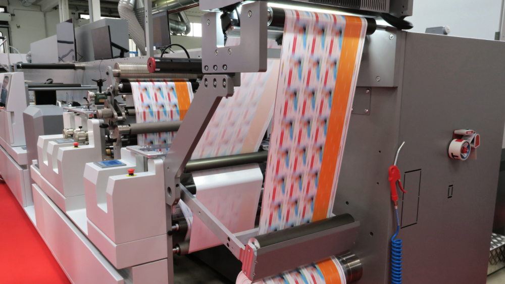
We use the four standard colours in a printing machine: cyan, magenta, yellow, and black (CMYK). Together, they represent the opportunities for most visual representations of different colours.
In order to achieve the same complementary colour effect in modern printing with CMYK colours, adjustments to the names and mixtures are necessary.
Read more: 5 things to consider before designing your new labels
3. Large label surfaces increase the chance of 360º visibility
With a larger playroom, your label will have a better chance of standing out on the store shelf. Naturally, the size must be proportional to the product itself and its packaging.
4. Smart Labels draw the customer to the product
With a Smart Label, you can incorporate digital elements to your label that will attract new and returning customers to your product. Skanem’s Smart Labels can be scanned using smartphone cameras, leading to a digital universe that enriches the customer journey. Simultaneously, the brand can collect valuable information about the product.

Smart Labels can be used for:
- Competitions
- Social Media Content
- Challenges
- Loyalty Programmes
- Applications
- Quizzes
- Customer surveys
- User Manuals
- Recipes
- Tutorials
- DIY-projects
With the ability to manage your Smart Label codes and collected data, you have the freedom to tailor your content to the changing needs of your campaign. This allows for greater control and flexibility in achieving success.
Read more: Enhancing customer experience through your labelling and packaging
5. Eye-catching details that trigger the customer's curiosity
It's a good thing that your product, with your label, aligns with the customer's preferences. Nonetheless, you still have several opportunities to include details that catch the consumer's eye and encourage them to purchase the product, even if it wasn't initially on their shopping list.
Shimmering foil with metallic details or glitter makes it undoubtedly easier to notice your product. The same applies to adding tactile textures on the label's surface. Textures such as sand or snakeskin or designs like three-dimensional raindrops or mountain tops can all help attract attention to your product.
6. Personalized messages
One-dimensional design details on labels can enhance the attractiveness of the container. Consider adding promotional or personalized labels with unexpected messages, titles, or local Indian names. These design elements can help the buyer connect with the product, which is especially important from a marketing standpoint where you wish to convert customers into ambassadors.


